MySonicWall
Web
B2B SaaS
Cybersecurity
Platform Redesign
Metrics were reported by SonicWall product management after rollout of the redesigned workflows.
Overview
MySonicWall is a cloud-based portal used by SonicWall partners and customers to manage security devices, licensing, and product lifecycle operations.
While the platform supported SonicWall’s growing partner ecosystem, it was not designed for scale. High-revenue partner users were managing hundreds of devices across multiple tenants, yet the system was built around single-device workflows.
Support tickets were rising. Registration was slow. Trials were buried. Page load times reached up to 10 minutes. If this redesign failed, our agency risked losing the SonicWall contract.
I led UX strategy and interaction design for the redesign of the platform’s core workflows.
Team
Sr Product Manager
Engineering,
Visual Designer
Product designer (UX lead) - me
Timeline
3 months
MySonicWall’s primary revenue users: Partners - managed hundreds of devices across multiple client tenants.
But the platform was built for individual device ownership. As partner accounts scaled, the system broke down:
Devices could only be registered one at a time
Products couldn’t be easily filtered or managed by tenant
Transferring devices between tenants was cumbersome
Large product lists took up to 10 minutes to load
Trials were buried and rarely discovered
Partners depended on the portal daily, yet it forced them into manual, repetitive workflows. The platform did not support fleet-scale operations.
To understand workflow differences, I conducted:
8 in-depth user interviews (Partners + End Customers)
8 moderated usability tests
Heuristic evaluation of legacy flows
Usage frequency differed drastically
End customers used the portal occasionally after initial setup.
Partners used it daily to manage fleets of client devices.
Partners operated at fleet scale
Partners were managing hundreds of devices across multiple tenants, making single-device workflows inefficient.
Operational tasks were repetitive
Registration, license management, and transfers were performed in bulk but the system forced one-by-one actions.
Legacy System Friction
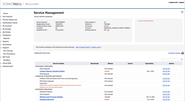
The legacy interface lacked bulk controls, filtering, and scalable data loading patterns. It was built for small-scale management.
Strategic Reframe
Rather than redesign individual screens, I reframed the platform around three structural shifts.
1
Partners created and managed devices across multiple client tenants.
The platform hierarchy needed to reflect this operational structure.
2
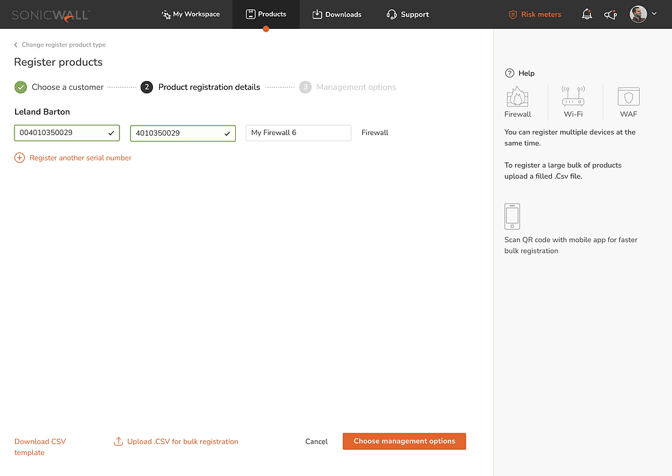
Partners frequently registered and managed devices in batches, yet the system only supported single-device actions.
3
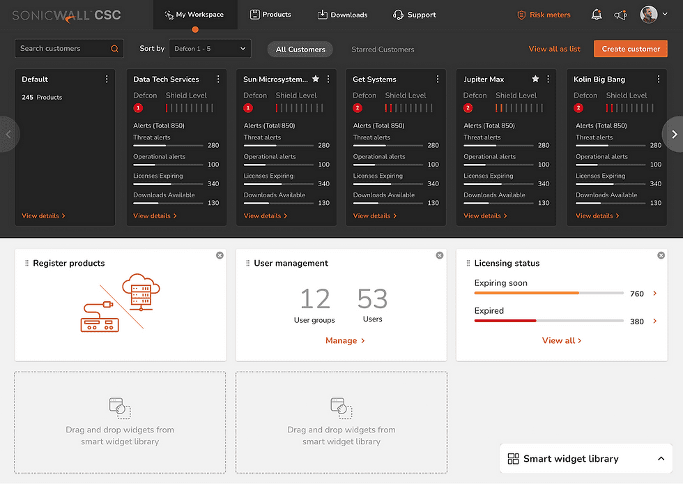
The difference is user types and the possibility of the multiple roles in a partner organization calls for an adaptible dashboard space customized for each user's critical tasks
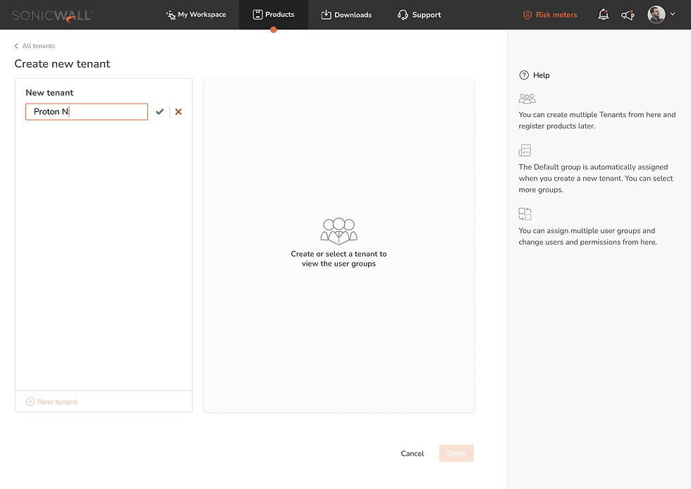
Information architecture
I redesigned the system hierarchy to prioritize tenants as the primary management unit.
Support
Downloads
Products
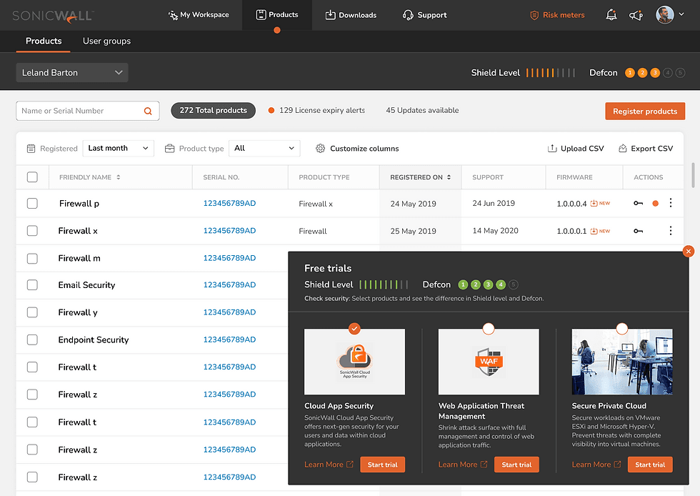
Bulk-First Workflows
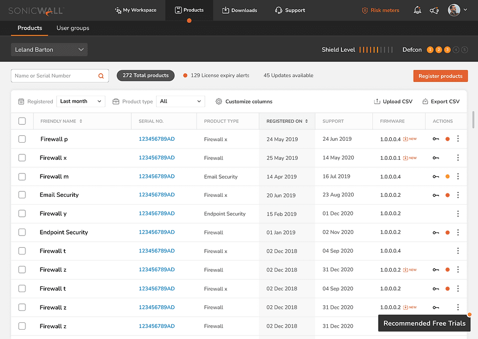
Problem
Partners managed hundreds of devices across multiple client tenants.
Yet:
Products could not be easily filtered by tenant
Transferring devices between tenants was cumbersome
The system hierarchy prioritized devices over organizational structure
The platform did not reflect how partner businesses operated.
Decision
Introduce bulk operations across core workflows:
CSV upload for product registration
Multi-select product actions
Bulk transfer between tenants
Filter-based selection logic
These changes were outside the original design scope. I advocated for them after observing real partner workflows.
Engineering challenge
Engineering was initially hesitant about introducing lazy loading for performance improvements due to backend complexity. I partnered with PM to prioritize performance as a user-critical requirement.
Problem
The dashboard contained static widgets that users found unclear and low-value. Different partner roles had different priorities, yet the interface treated them the same.
"Yeah I don't know what any of this stuff means. Looks nice though"
- User during the interview
Decision
I redefined the dashboard as a Workspace:
Drag-and-drop smart widgets
Role-based customization
Tenant health indicators (“Shield Level”)
Configuration saved per user
This was not part of the original scope, it emerged from understanding operational role differences.

Problem
Software trials were buried in the navigation. Trial discoverability was low, limiting expansion revenue opportunities.
Decision
I embedded trials directly within product workflows:
Trial recommendations surfaced in product view
Preview of how trials affect tenant “Shield Level”
Clear activation within operational context
This aligned monetization with task flow instead of isolating it as a marketing action and improved visibility of trial options within the workflows partners used most frequently.
Impact
Metrics were reported by SonicWall product management after rollout of the redesigned workflows. A mail of appreciation was sent from the VP of SonicWall along with new projects.
Reflections
If revisiting the project today I would:
• Push harder against horizontal scrolling in tenant lists, which could create scalability issues.
• Establish baseline success metrics earlier to better measure improvements.
• Align earlier with engineering on performance architecture to reduce technical friction.
© 2026 Saumeel Sondur. All rights reserved.